Donald Cant Watts Corke – Sub-brand Design, Development, Creative Direction & Strategy


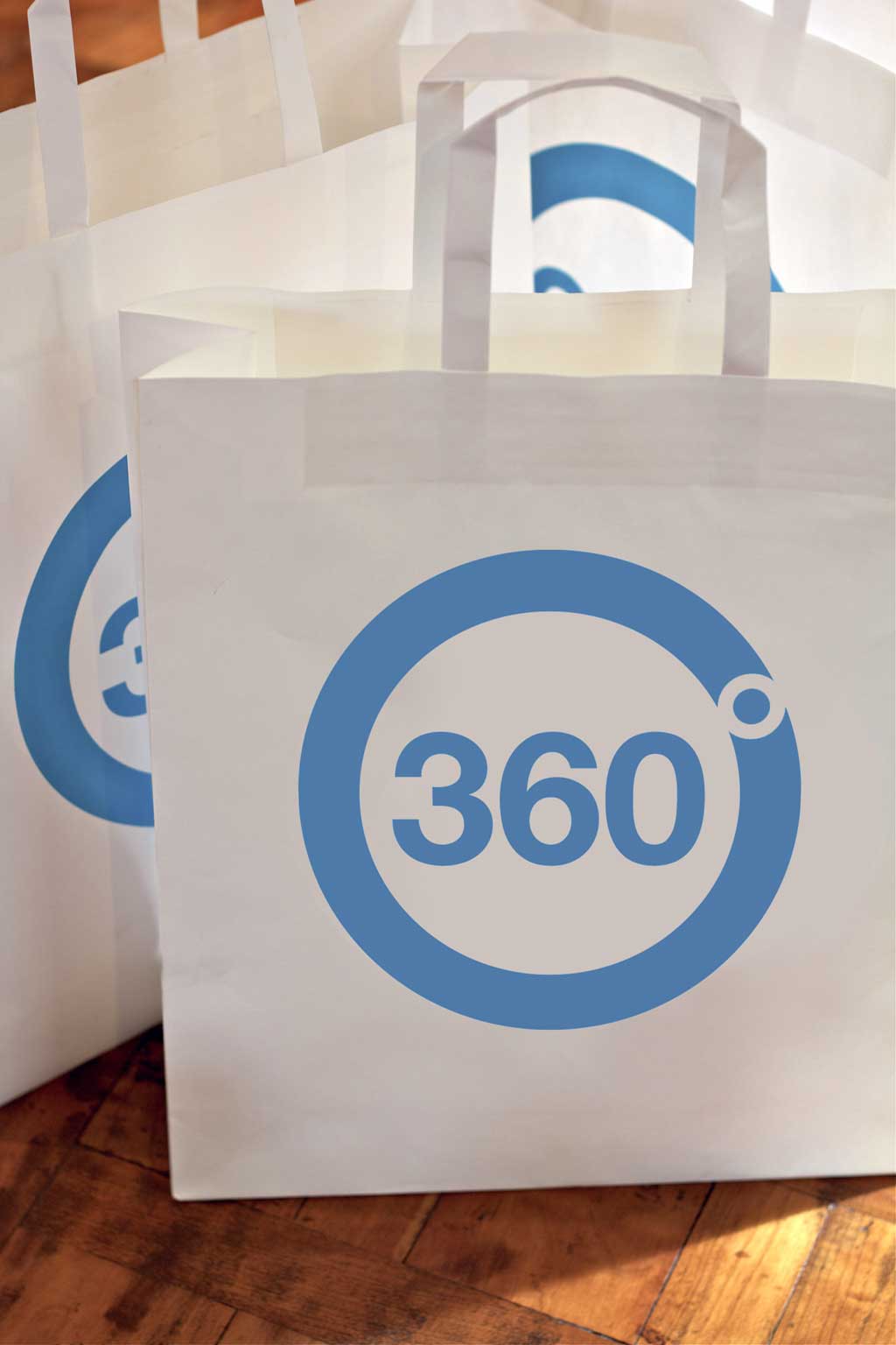
After establishing a firm ethos, we moved onto the visual design stage of the journey. Here, we developed a logo, typography, colour palette and imagery. We incorporated Donald Cant Watts Corke’s existing corporate typography into 360˚, thus ensuring cohesion between the two brands.
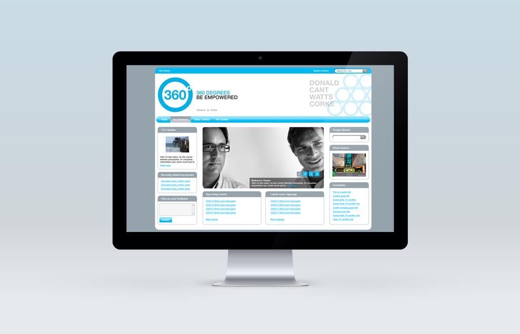
Donald Cant Watts Corke was very excited about the implementation of their new internal brand. In order for 360˚ to successfully reach all Donald Cant Watts Corke employees, an intranet was developed as the key distribution platform. We also developed a vast range of marketing collateral to support 360˚ and raise employee awareness of this exciting new initiative.
Since the launch of 360˚, we have received fabulous feedback across the Donald Cant Watts Corke team about the success of the campaign.
