Joy Foods – Brand Development & Strategy, Website & Product Packaging Design
Joy Foods prides themselves on being a 100% Australian-owned and operated family business for 25 years. They believed in family traditions and using natural ingredients to make delicious cereal and bars. They want to depict themselves as a ‘Fun’ Brand for the family, which is suitable for all ages.
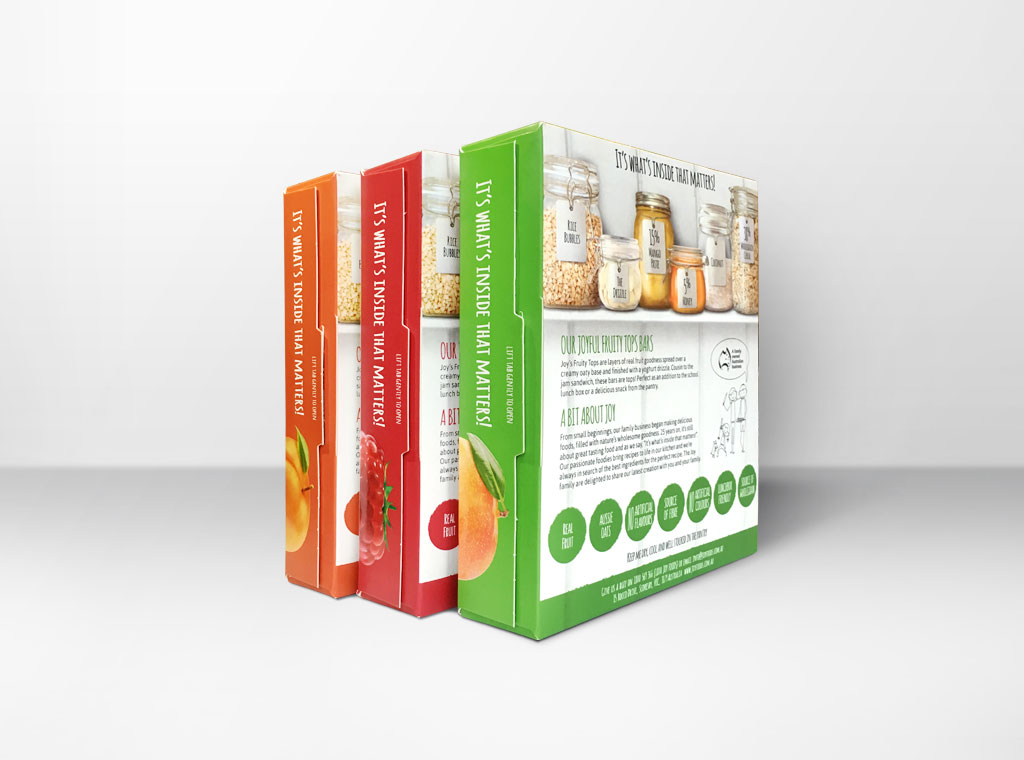
Solution: RLD Strategic helped Joy Foods to explore and gain insights into their brand potential. Through market research, branding workshops and close communication, “It’s what’s inside that matters” was born as Joy’s Fruity Tops tagline which talks to the origin of the ingredients and the need for a product to actually taste good! This strong statement leads most of the direction for all Joy projects. We proposed the retention of the bright orange. This colour also represents the Australian blazing sun which has nurtured the grains and products that Joy use.
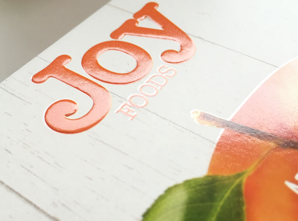
Outcomes: We simplified the brand with a new type face and to emboss the brand on the pack to make a premium statement, plus creating a set of presentations/proposals to keep its branding consistency.
Joy Foods Brand Evolution – Developing The Perfect Pack
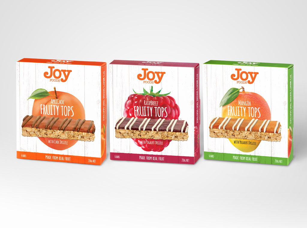
The current market was saturated and controlled by very few brands such as Uncle Toby’s and Carmen’s who had dominated shelf space and loyal customer bases. Their targets were slightly different so it allowed some market penetration. Joy Foods developed a great tasting quality product, but in order to gain shelf presence amongst these intimidating players, they needed to stand out on a shelf and be memorable.
The packaging needed to fit with its new found positioning and be unique to compete with these existing competitors.
Direction: We’d like to highlight Joy’s authentic background with a farmhouse inspired – Aussie, homemade and traditions.
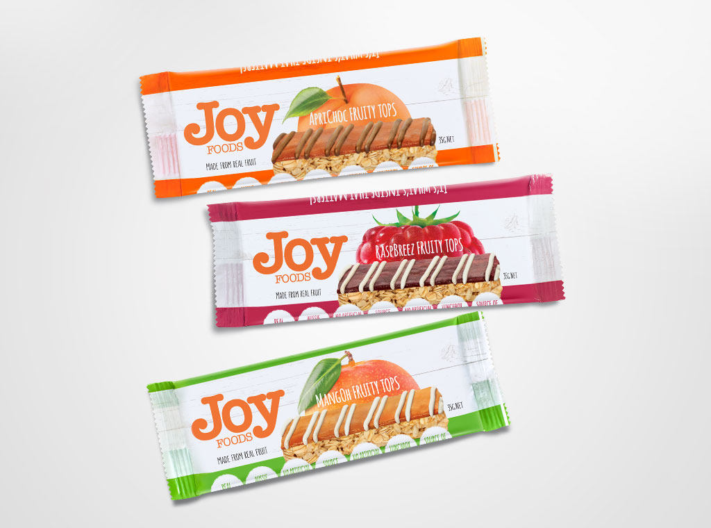
Solution: Joy’s bar was positioned in a higher range market; hence we proposed a premium look and feel with clean design, such as white background board, distinctive bright colour patches which also helps with the memorability and creates block colour to attract attention; hence, improved invisibility. We’ve developed ‘It’s what inside matters’ plus different jars visual to refocus on their quality ingredients and being ‘honest’ about the bars – one of Joy’s key values. Based on our research, we decided to introduce our family characters, who are simple and fun! Not only did this decision utilise the consumers’ preferences to create familiarity, but also to be integrated with our Digital Strategy, including Website and Social Media. Additionally, in order to maximise the shelf space, we looked into various shapes and sizes to offer the most appropriate dimension.
Outcomes: Our journey with Joy has gone through various concepts and we have delivered the optimal solution, which helps them successfully landed the product proposal with Woolworth with MangOh, RaspBreez and ApricChoc – these clever playful names were created to add to the ‘fun’ factor. We also extended the packages to rewind, shipper, etc.
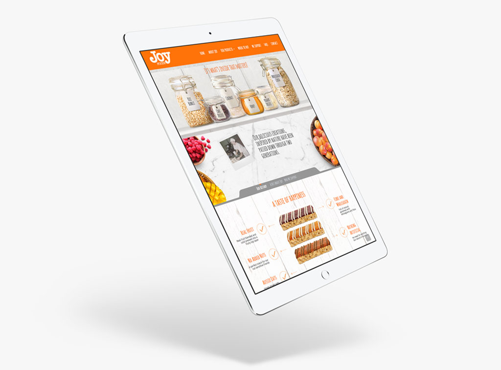
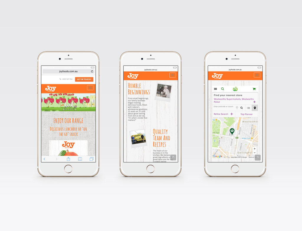
Website & Animation – Finding The ‘Fun’
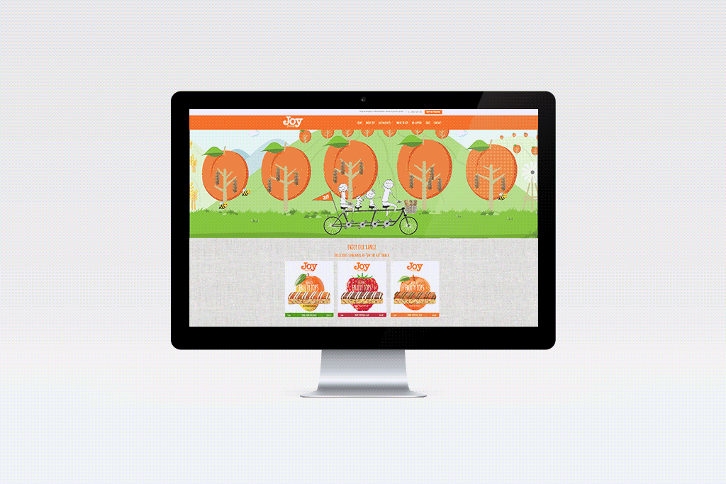
Revamping the website is part of our Digital Strategy to re-engage our customers, promote the brand and provide a rendezvous point. Joy Foods proposed to have an animation banner on-site to create movement to endorse liveliness, especially, ‘fun’. We’ve partnered to prepare the content on the website which is inherently aligned closely with Joy’s values as an ethical manufacturer.
Direction: We keep the graphic minimal, clean and simple to create consistency with the packaging.
Solution: Introducing our family in motion is part of our branding integration with the illustrations developed based on the fruits’ shapes on the boxes. This animation reinforced the ‘Fun’ part of the brand and create a friendlier interface to our audience. Also, none of Joy’s competitors have utilised their characters to enrich their brand’s stories through any extension. Our content copy dedicated a section for the Ingredients — a key issue as many consumers are highly aware of what they eat and what is safe for their family.
Outcomes: A responsive website with minimal design which is clear and resourceful, plus a peace of mind of the consumers.